From royal banquets to school cafeterias, from New York’s paper coffee cups to the whisky glass in Blade Runner… This time, we trace the history of design through an object we rarely put down: the drinking glass.
Could we call the drinking glass one of the more unfairly overlooked objects in design history? Or would that be an exaggeration? Still, think about it: when was the last time you stopped to consider this extremely useful object while drinking water or sipping the iced coffee you ordered at the café where you supposedly came to work?
Chairs are known by their designers’ surnames, lamps end up at auction, and we look at clothes to talk about the spirit of an era. The glass, meanwhile, is usually placed on the table, filled and left to get on with its job.
And yet almost every design trend of the past two centuries has somehow left its mark on its form. There was the splendour of 19th-century crystal, followed by mass production and the idea of “good design for everyone.” Modernists stripped away ornament, Scandinavians tried to make glasses stack more efficiently in kitchen cupboards, and in the 1960s someone shifted a glass’s centre of gravity so you could hold a drink and a cigarette in the same hand. New York turned a disposable coffee cup into an urban icon, while the Italians designed a whisky glass so striking that, years later, Ridley Scott placed it in the Los Angeles of the future without hesitation.
Which is why it would be impossible simply to call the following 10 glasses examples of “good design” and leave it at that. Some reflect codes of etiquette, some technological innovations, and others ways of life that have since disappeared. Perhaps that is also why, if you put them all side by side on the same table, they probably wouldn’t like each other very much.
Contents
Baccarat Harcourt 1841
A Little Water, a Little Empire
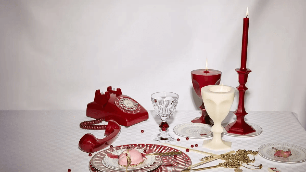
Before minimalism had even entered the conversation, the table was expected to put on a bit of a show. Baccarat’s Harcourt, designed in 1841, is exactly that kind of glass: heavy, sharply cut and with absolutely no intention of disappearing into the background.
With its hexagonal foot, three-part stem and broad facets, it feels almost like a small piece of architecture in the hand. There is a reason it remains one of Baccarat’s best-known designs after 185 years of continuous production. Look at a Harcourt and you can see, all at once, the 19th century’s entire idea of what a proper table should look like. From today’s perspective, it can even feel like a little too much. Thick crystal, cuts, symmetry, an elaborate foot… Even if you are only drinking water from a Harcourt, you somehow feel as though you ought to have ordered champagne.
Crystal at the time was more than simply a “beautiful material” in the modern sense. It was part of wealth, ceremony and proper table etiquette. From the era of Napoleon III and Empress Eugénie onwards, Harcourt found its place on royal tables, at diplomatic dinners and state banquets. The better it caught the light, the better it was doing its job.
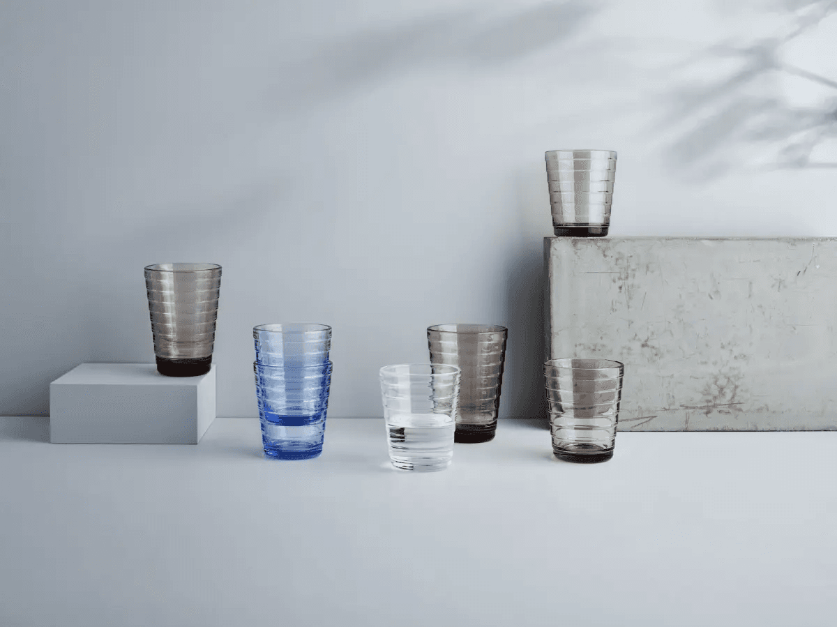
Aino Aalto, Iittala, 1932
Modernism Finally Makes It Into the Dishwasher
Designed for Iittala in 1932, the series is formed from a succession of horizontal rings. Iittala associates the shape with ripples on water, but the rings have a far more practical benefit alongside their poetry: they make the glass easy to grip and allow it to be stacked. Better still, it could be mass-produced using pressed-glass technology. The Aino Aalto collection has remained in production since 1932 and received an award at the Milan Triennale in 1936.
An important footnote is in order here. We have become so accustomed to automatically thinking of Alvar Aalto whenever we see the Aalto name that Aino’s role in design history is unfortunately often overshadowed by that of her husband. Yet Aino Marsio-Aalto was an architect, designer and co-founder of Artek, and a major figure in shaping what the modern Finnish home would look like.
The glass also captures modernism at its most likeable. What was modernism, after all? It wasn’t only white villas, tubular-steel chairs and architects posing sternly for black-and-white portraits. It was also someone opening a kitchen cupboard and asking, “Wouldn’t it be better if we could stack these?”
Almost a century later, the form feels so ordinary that you could easily assume it had been designed for IKEA yesterday. That is the fate of good everyday design: first innovation, then standard, and finally invisibility.
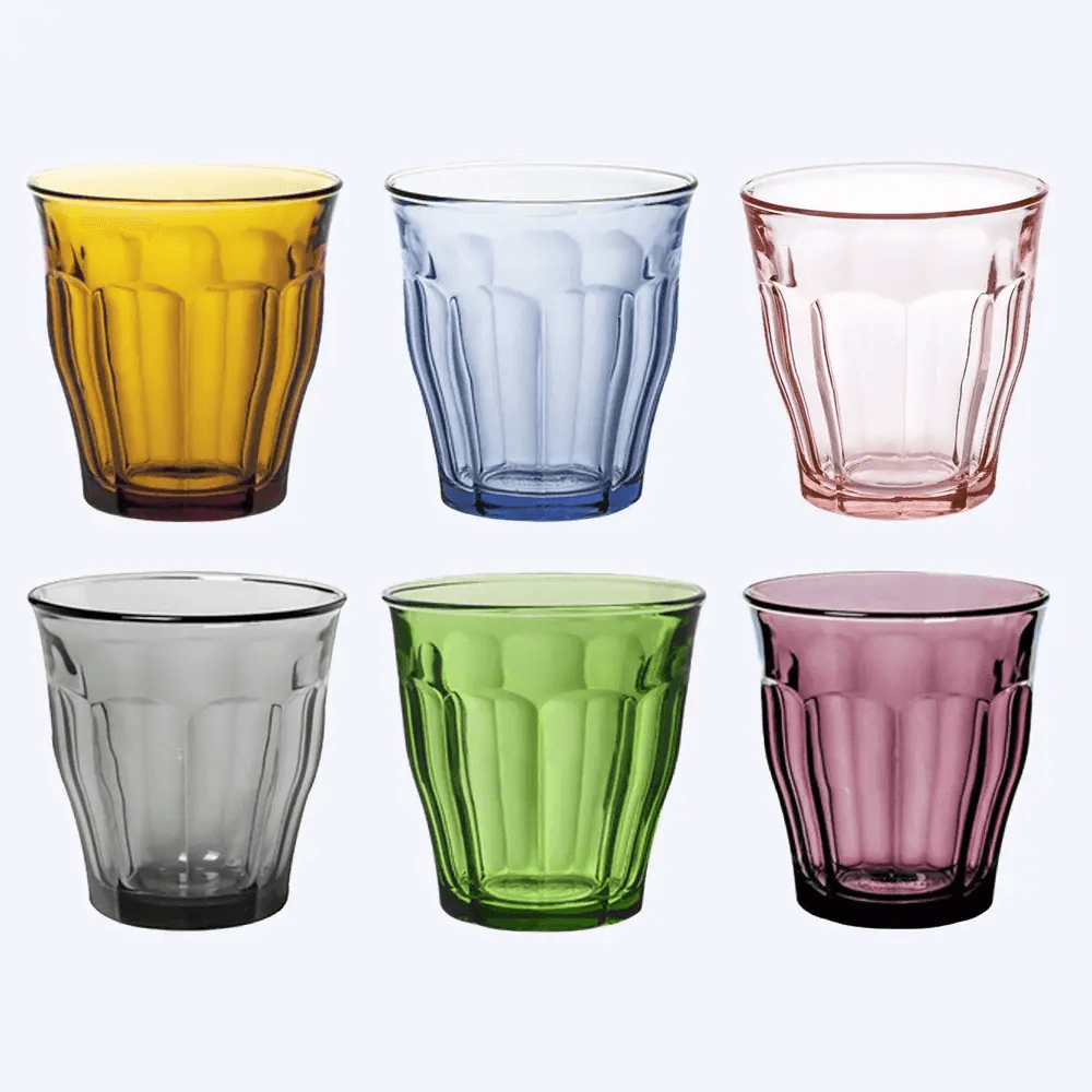
Duralex Le Picardie, 1954
The Cafeteria Kid
There are some glasses you instinctively handle with a little caution. Not Duralex. That was, in fact, the whole point.
Introduced in 1954, Le Picardie is one of the most familiar examples of tempered-glass technology entering everyday life. Its slightly flared body and nine facets give it both a secure grip and enough character to be recognisable from across the room. In French bistros, it arrives at the table alongside a carafe; in school cafeterias and homes, it is stacked one inside another. Water goes into it, coffee goes into it, table wine goes into it. It isn’t particularly fussy.
For several generations in France, people’s relationship with Duralex has less to do with design history than with school breaks. The tiny numbers on the base of the glasses indicate which mould they came from during production—a spectacularly dull piece of information used to trace defective pieces at the factory. Put it in the hands of children, however, and it becomes something else entirely. Everyone turns over their glass in the cafeteria, and whatever number appears underneath becomes their age for the day.
A factory quality-control code becoming a children’s game may be one of the best details for explaining why Duralex is so loved.
And there is no sanctified designer name behind Le Picardie either. The hero is the object itself. A glass produced millions of times, dropped, washed, stacked and returned to the table again and again. Put it in a museum and it becomes a design classic. Put it on a bistro table and it is simply a glass. Both are true.
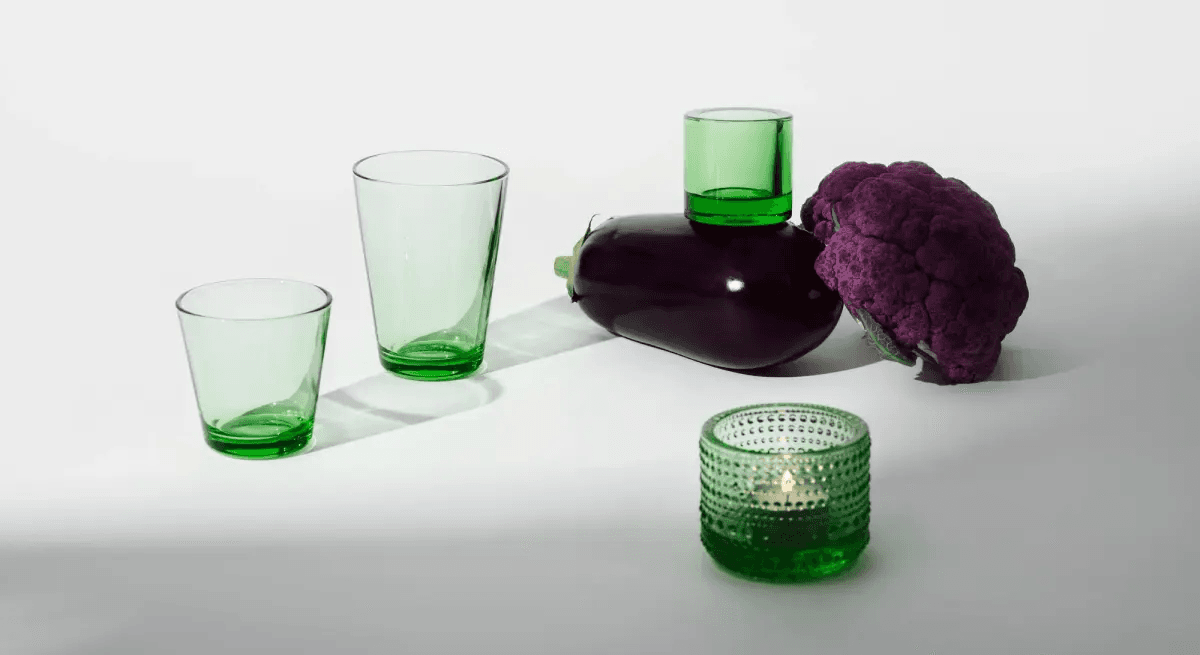
Kaj Franck, Kartio, Iittala, 1958
What Else Can You Take Away From a Glass?
The remarkable thing about the 1958 Kartio is that there is almost nothing remarkable about it. Circular base, gently widening body, the right thickness, the right proportions. Done.
One of the descriptions Iittala uses for Franck is “the conscience of Finnish design,” and not without reason. Franck opposed the idea that tableware had to consist of dozens of perfectly matching pieces. He believed mass production could be used to create accessible everyday objects that could be mixed and matched. Kartio is that philosophy translated into glass.
Its real accomplishment lies not in what was added to the form, but in what was removed. Imagine the glass slightly taller, its rim slightly wider or its base slightly thinner, and you immediately realise how carefully those proportions were calculated. It is not an ostentatious design, yet nothing feels wrong when you hold it. That is the slightly irritating success of objects like this: explaining why they are good is difficult until you encounter a bad version.
Franck did not confuse simplicity with colourlessness either. Produced in different shades, Kartio can take on an entirely different personality without changing its form. Pale blue feels cool and almost invisible; dark green is far more serious. As the form recedes, colour steps forward.
Comparing Kartio to the perfect white T-shirt may still be the quickest way to explain it. It does not promise much on the hanger. And then, for years, it is the one you keep reaching for.
Leslie Buck, Anthora, 1963
Conquering New York With a Paper Cup
Sometimes, being designed to end up in the bin 20 minutes later is enough to secure a place in design history.
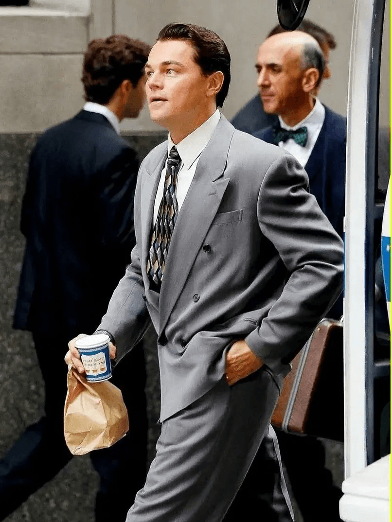
The Anthora paper coffee cup, created by Leslie Buck for the Sherri Cup Company in 1963, is one of the finest examples. Blue-and-white ground, a Greek meander border, two amphorae and the gold-coloured words “We Are Happy to Serve You.” The image is so unmistakably New York that you could comfortably place it alongside a yellow cab or subway map.
Behind it was an extremely simple commercial observation. In 1960s New York, a significant number of diners and coffee shops were run by Greek immigrants. Buck realised that if he wanted to sell them cups, it might help to speak their visual language. The blue and white of the Greek flag, classical motifs, amphorae… The design was born from sales instinct. Released in 1963, the cup gradually became part of the city’s folklore.
Buck, whose real name was Laszlo Büch, was a Czechoslovak-born immigrant who survived Auschwitz and Buchenwald before moving to the United States. He had no formal graphic-design education. Yet the object he created passed through more hands than many of the professional design world’s celebrated “icons.”
By the 1990s, hundreds of millions of Anthora cups were being sold. A disposable cup had effectively become a city logo. Next to today’s coffee-chain cups, with brand names printed across them in giant letters, the Anthora almost feels romantic.
After all, it branded New York.

Joe Colombo, Smoke, 1964
Who Cares About the World?
If someone told you today, “We designed this glass to make it easier to drink while smoking,” every light in the corporate communications department would go out.
In 1964, however, this was a perfectly reasonable design problem.
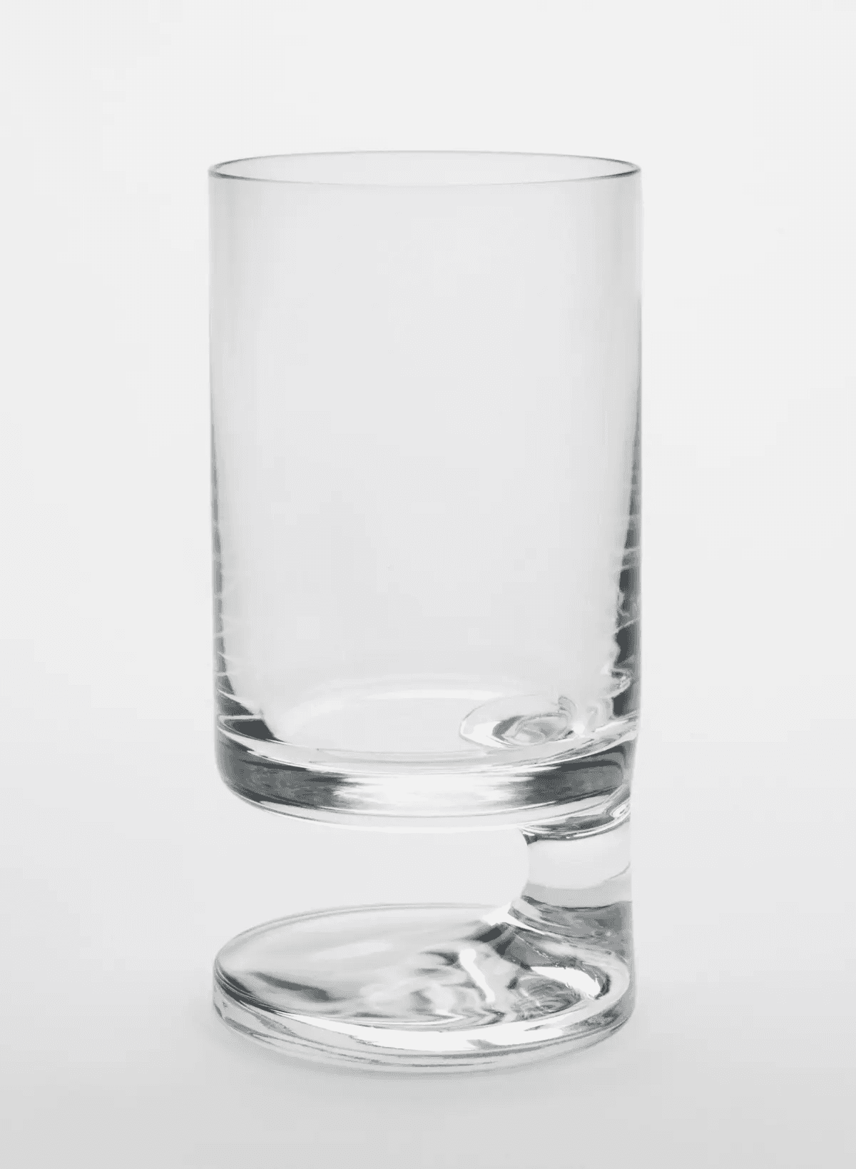
The base of Joe Colombo’s Smoke glass shifts sideways, creating a space on one side of the body for the thumb to grip. This allows the glass to be held primarily with the thumb, leaving the other fingers free for—yes—a cigarette. The British Museum describes Colombo’s idea as one of the first departures from the traditional symmetrical form of a drinking glass.
Looking at the object today, an entire era seems frozen inside it. Cocktail hour, rooms filled with cigarette smoke, low-slung furniture, Space Age interiors, generous quantities of brown and orange… Colombo was already one of the figures in 1960s Italian design most obsessed with the future. He did not think of furniture simply as individual objects, but as systems in which people would live: plastics, modularity, new manufacturing technologies, compact living units.
Smoke is the miniature version of the same mindset. How does a person behave? How do they use their hand? How can they maintain two habits at the same time?
That is also one of the pleasures of design. Sometimes an object anticipates the future. Sometimes it perfectly records a habit the future will eventually eliminate.
Smoke belongs to the second category: a fossil of social life from 1964.
Tapio Wirkkala, Ultima Thule, Iittala, 1968
As If It Came From Lapland, Not the Refrigerator
When discussing Scandinavian design, the phrase “inspired by nature” has become so inevitable that it may as well be required by law.
With Ultima Thule, however, the cliché happens to be true.
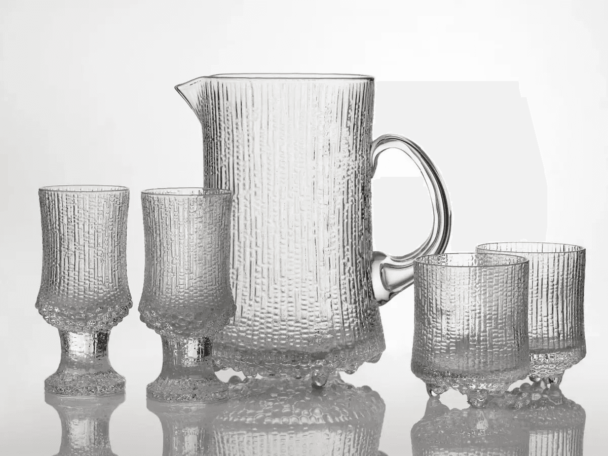
Created by Tapio Wirkkala for Iittala in 1968, the series translates the surface of melting Lapland ice into glass. The droplets, grooves and tiny bubbles across its body, together with the icicle-like feet at its base, are not decoration applied afterwards; the entire identity of the object comes from this texture.
According to Iittala, Wirkkala worked directly on the mould surface, while developing the glassblowing technique required to achieve the desired effect took thousands of hours.
The result feels both primitive and futuristic. As though it had not been bought from a shop at all, but broken off a glacier somewhere in the north and placed directly on the table.
Ice floating inside a glass that itself looks like ice.
Claus Riedel, Sommeliers, 1973
Did It Make Drinking Wine Unnecessarily Complicated?
Burgundy should be drunk from one glass, Bordeaux from another, Riesling from another.
When you hear that sentence today, there are two possibilities: either you are sitting at the table with a very serious wine person, or nobody has yet considered who will be doing the washing up.
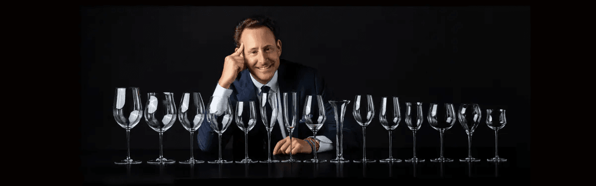
Claus J. Riedel played a major role in creating this world. The ninth generation of the Riedel family, Claus began in the 1950s to approach the wine glass not as a decorative object but as a tool capable of changing the perception of wine. He moved away from traditional cuts, colours and ornamentation towards clear, thin-walled, long-stemmed forms. Released in 1973, Sommeliers represented the culmination of this idea: a collection that developed different glass shapes for different wine profiles.
Riedel’s argument was that the size of the bowl, the width of the opening and the overall form influenced both how aromas reached the nose and how the wine was perceived in the mouth. The company still places this idea at the centre of its product philosophy today. How much of that is physics, how much is sensory psychology and how much is brilliant marketing is a separate—and highly entertaining—debate.
From the perspective of design history, however, the result is indisputable: Riedel changed the way people looked at the wine glass. Once, there was simply “a wine glass.” Then came the question: “For which wine?”
Cini Boeri, Cibi, Arnolfo di Cambio, 1973
Designed in 1973, Looking Like It Arrived From 2019
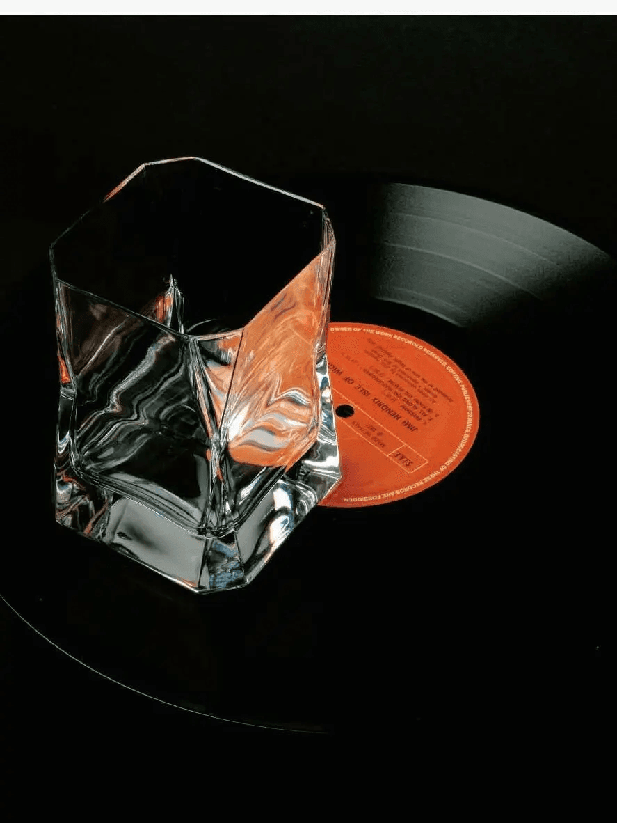
The best-known piece in the Cibi collection, designed by Cini Boeri for Arnolfo di Cambio in 1973, is the thick-crystal Double Old Fashioned glass. Seen from above, it approaches a square; its surfaces curve inward and outward to create a heavy, sculptural form. Fill it with whisky and it almost seems to refract light rather than hold a drink. And then came Blade Runner. Cibi gained a second life in popular culture as the glass used by Rick Deckard in Ridley Scott’s 1982 film. The futuristic object chosen to evoke the dystopian Los Angeles of 2019 was already nearly a decade old at the time of filming.
Arnolfo di Cambio still catalogues it today as Cini Boeri’s 1973 design, while its connection with Blade Runner has become inseparable from its identity. It is, in fact, a very effective trick often used in science-fiction production design. Instead of inventing the future from scratch, find an object in the present that already looks strange enough. A shortcut to timelessness. Boeri’s glass also carries that wonderful attitude of Italian design from the period: “Functional, yes—but why shouldn’t it also be a little sexy?” Place it on the table and it makes its presence known. Heavy. Angular. Slightly threatening.
Jasper Morrison, Glass Family, Alessi, 2008
The Designer Finally Leaves the Glass Alone
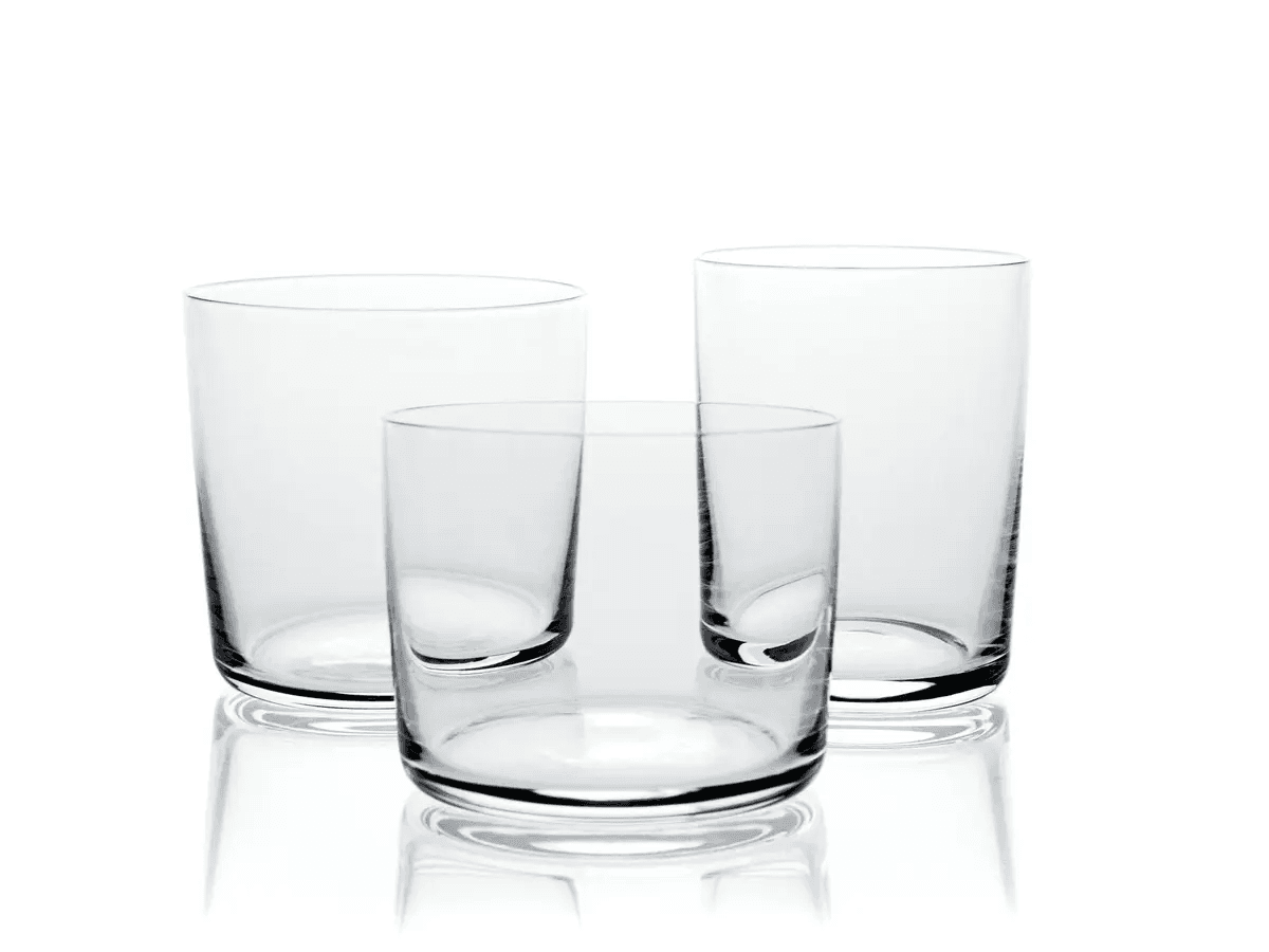
At first glance, Jasper Morrison’s Glass Family, designed for Alessi in 2008, looks like the last object imaginable to earn a place in design history.
The water glass looks exactly like a water glass. The wine glass looks exactly like a wine glass. There is no grand gesture, no colour, no joke, not a single detail raising its hand to announce, “Look at me, I’m a design object.” That is precisely the point.
The idea of the “Super Normal,” developed by Morrison with Naoto Fukasawa, challenged the notion that good design constantly had to appear new and attention-seeking. Morrison has spoken about old, anonymous blown glasses he encountered in a second-hand shop and how he began comparing his own designs with objects of this kind—eventually coming to regard not being noticed as a positive design quality. Glass Family is that idea made flesh. Or rather, made glass.
Alessi began producing the series in 2008. The base of the water glass is slightly thicker for stability, while the glass itself becomes thinner towards the rim. So even while it appears as though no design is taking place at all, every millimetre has still been considered.
That is why I like putting Glass Family at the end of this list.
In 1841, Harcourt was doing everything it could to tell everyone at the table about its status. Around 170 years later, Morrison seems to tell the glass: “You don’t have to say anything. Just do your job.”
Cover Photo: Archive Photos / Getty Images
Iconic Chairs of Design History
Modern Interpretation of Bohemian Glasswork: Rêve de Cristal