On Designing Book Covers with Utku Lomlu

With Utku Lomlu, the designer who is known with the changes in the covers of Can Publishing as well as many successful book cover designs, we came together at his studio opposite of Orhan Kemal Museum to have a pleasant conversation about the awards he recently received with his Classic Women Series and the design of the books.
Photos by Serkan Eldeleklioğlu
How does the process of designing the cover of a book develop?
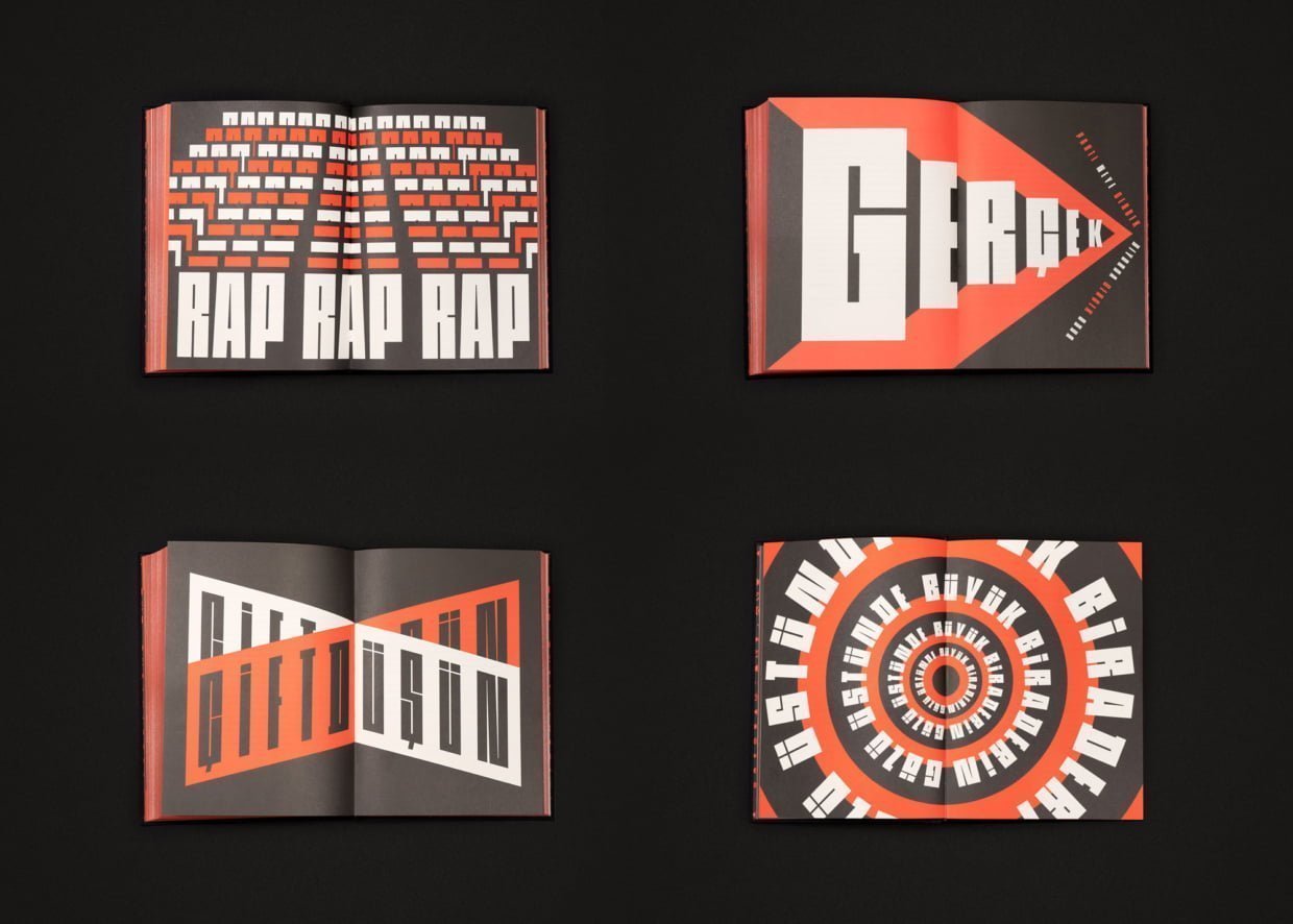
Editorial board meetings are regularly held by the publishing house and the works of that month are determined. Editors prepare briefs about their books for the month. In this brief, there is a lot of information such as the summary of the book, information about the author, her/his previously published books, the target group of the book. I am starting the research process in line with this brief. Brief is a very limited thing when it comes to a book. If it is a translated work, we must consider her/his other books translated in the world, the period in which the author lived, the literary circles and art movements (s)he was influenced by. After this research process, the questions of what design language is appropriate for this book and what kind of cover or identity language should be created are answered. Afterwards, I generate draft works in accordance with this. And then, among these drafts, a decision is made based on the publishing house, the foreign agency from abroad, or the author in Turkish literature. In this way, the process is completed.
Our visual memory and world are also like prejudices, it is not easy to break and change them.
I want to touch on your journey in Can Publishing. You have changed the white covers that Can Publishing has been using for 30 years and that its readers are accustomed to. It is not easy to change the covers of a publishing house like Can Publishing, which has a rooted readership. How did this process develop for you?
They first came with such a request from the publishing house. They stated that they wanted to realize this change with me. I had various awards in the field of design before; after all, it was quite understandable that they wanted to work with someone who had proven himself. Then we sat down and talked; how we do it and how we can manage positive or negative reactions. And then the process started. On the other hand, we have taken a visual image of the childhood of many people over a certain age and replaced it with something else. Our visual memory and world are also like prejudices, it is not easy to break and change them. Therefore, there were negative reactions but there were also very positive reactions by the way, I can say half the rate. But over time, people got used to it, and I think that many readers who found this change strange at first are satisfied with the current situation, and I receive a lot of messages in this direction. Also, as you know, various national and international awards were received during this process. Now Can Publishing is one of the most ambitious publishing houses in the world in terms of cover design. Some of its covers are requested and copyrighted by various publishers in Asian and European countries.
I believe that the identity of a publishing house should never precede the author or the work. In Can’s white books, the publishing house was so prominent that many writers were lost on that white cover.
How did you find those white covers before you started working with Can Publishing?
First, I am a person who is very familiar with the books. There are not only the white covers of Can but also Yapı Kredi had series templates, some of which are still in progress and Ayrıntı and İletişim as well as Metis also had templates. There were templates created by many publishers; these are formulas that were devised by considering production costs and production speed, but in the world, we live in today, it is much more important to be original. On the other hand, I think that the cover of the book shows the value that the publisher gives to the author and the reader. Not only the cover of the book, but also its print quality, translation quality and how it is handled editorially are always related to the value a publisher gives to the reader and the author. I think the identity of a publishing house is not the uniformity of the book covers, but the things I have just mentioned. Elements such as the works the publisher has chosen and published, the quality, and the way it treats literature, I think, shape the identity of a publishing house. Even if they did not have the white covers, Can Publishing would still be Can Publishing today with its published works; nothing was missing. I consider more like this.
I believe that the identity of a publishing house should never precede the author or the work. In Can’s white books, the publishing house was so prominent that many writers were lost on that white cover. While the author and the work have their own identity, it is not a right thing to become more superior for the identity of the publisher and to present every author or every work in the same way. In most cases, what the reader really wants to get is the work itself, not the publisher; therefore, I think that the cover should belong to the work, not the publishing house.

While I was talking about the book covers, I thought of the covers of Lolita. In some cultures, there are designs in which the female body appears on Lolita covers and the textual value remains in the background. Therefore, I find book covers very important in terms of telling the text.
Of course, book covers change from culture to culture; besides the general design culture of a country, I think the reading culture and book cover habits are also decisive in this variability. For example, there is a big difference between the book cover concept in our country and in the USA. From a cultural point of view, this variability is quite normal. I think this also adds richness to the work. I take great pleasure in looking at and questioning the different covers of the same work designed around the world; the way different designers interpret a work can reach very interesting points.
I dedicated this award to the suffered and oppressed women in the world.
The Classic Women Series you designed for Can Publishing also brought you the EdAwards Gold Award. Could you talk a little bit about the design process of the Classic Women Series?
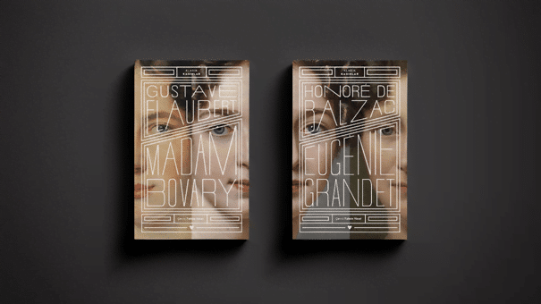
I regard every design I make as a problem. In general, an eight-book series consisting of four female writers and four female protagonists, it was necessary to think about women because there were women: First, I went for an analysis of combining classical women with portraits of women in paintings. Then, when you think about women throughout history, they all have similar stories that somehow connect each other. I even gave a speech about it at the award ceremony. I dedicated this award to the suffered and oppressed women in the world. There was the idea that women should somehow complete and continue each other, I wanted to somehow reflect the invisible bond that exists between women on the covers, and I found such a solution. Afterwards, I placed the book titles typographically on a ground based on this idea.
How do you decide on the font when it comes to writers?
I believe that the human character has something that overlaps with the typeface. When dealing with an author, I take care to match her/his world and her/his writings with the font I chose for her/him.
In addition to these, I would like to mention the works of Lom Creative Studio. Could you talk a little bit about the work you do?
The book cover is our apparent work. Apart from that, we also provide services to many corporate companies. There are many different brands such as Vitra, Eczacıbaşı, Koç, Işık University, Exporters’ Association. Many of them are from the building sector; we generally produce corporate identity and design products.
Can we say that you are more emotionally attached to the book cover design?
Yes, I am very emotionally attached to it, I come from that world. I have a strong bond with the book and the publishing world, and it is an area where I approach it emotionally. I see the brand I work with not as a customer, but as a cultural structure of which I am a part. Thereby, of course, there is that emotional connection. Creating a face for a written literary work is something I highly value.
Are there any books you have designed that have a special place for you or that you can call a turning point?
There are many, and it accumulates over time. That’s why it’s hard to choose one; for example, my award-winning works are usually the ones I love the most. Apart from that, things that have never come to light are also different. There are covers that were not accepted by the publishing house for various reasons, or alternatives were chosen, but sometimes I like more the ones that were not chosen. The fact that it will never come to light creates a special bond for me.
Are there any books that you wish you had designed the cover of?
Even though I have an emotional connection with the book and designing the book cover, when it comes to my job, I must keep a distance from the work and approach all of them equally. Therefore, there is no specific work, but I can still refer many works that have left their mark on the history of literature: Lolita, Don Quixote…
Sometimes you design the covers of the books that will be reprinted, and sometimes you design the covers of the books that will meet the readers for the first time. What is the difference between these two design processes for you?
It is necessary to place something new than what was present in the previously designed ones, there is a desire to do better. That’s challenging, too, and I like to be challenged.
I believe, there are words that writers evoke in us, for example, when Sait Faik is mentioned, “island” comes to mind. I would like to ask you about these associations through colors. I would like to start with Erdal Öz, since we talked a lot about Can Publishing and I love him too. What color does he remind you of?
Blue.
Nâzım Hikmet?
He is also blue.
Sait Faik?
Earth color. Yellowish.
Orhan Pamuk?
Maroon.
Yaşar Kemal?
Deep brown.
Gülten Akın?
Blue.
Some book covers designed by Utku Lomlu:
